Showing posts with label symmetrical plan. Show all posts

Wednesday, March 27, 2019

74 W Main St. Clinton, NJ


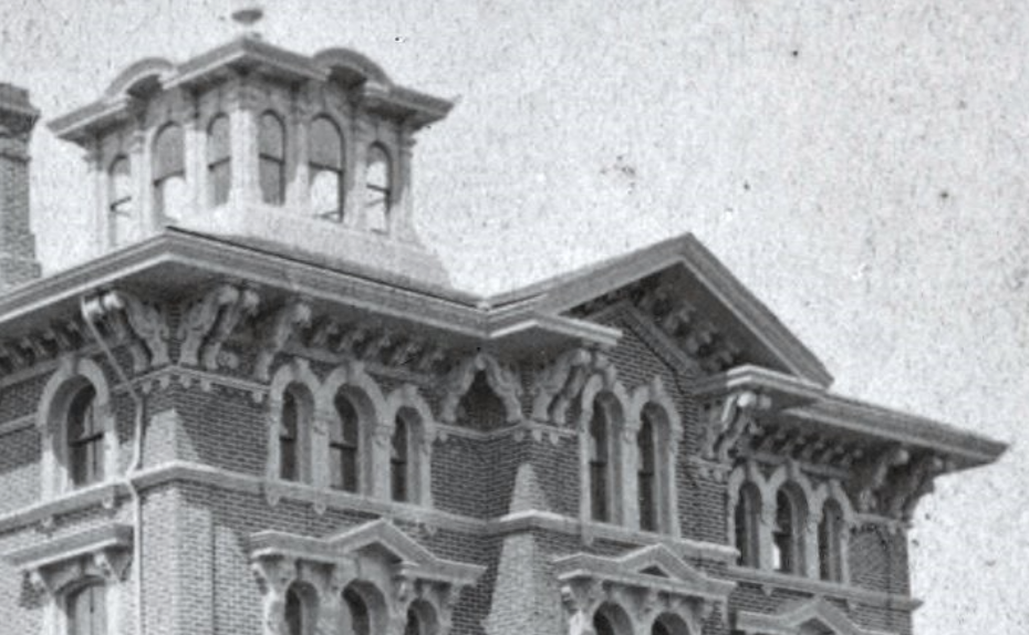
Just a few lots down from the Bosenbury house is this interesting gem, a symmetrical plan house which is oddly five bays on the first floor and three bays on the second floor. On the first, the house is surrounded by an oddly asymmetrical porch which wraps around one side but not the other leaving us with a four bay porch that does not present a symmetrical number of bays on each side. The front door has a Greek Revival eared molding surround. On the second floor, all the windows are segmental arched with a double window in the center with a pointed molding with a vegetal anthemion above. There is an engaged open pediment above with the typical Clinton wheel window, this time with eight spokes rather than four. Oddly, the pediment is deeply enclosed by the eaves. The design unfortunately suffers from a rather odd painting decision, with the bordering boards not painted to form a unity with the entablature, which if painted the same color would make the design much clearer. The house likely dates from the 1850s-60s.

Sunday, April 8, 2018

The Thomas E. Powell House, Columbus, OH

The Thomas E. Powell House, Columbus, OH. 1853
Both Photos Columbus Illustrated and History of Columbus


Although not part of E Town Street, but part of the E Broad Street area, another mansions street in its own right, I couldn't resist this rather bizarre Italianate of 1853. The house is a symmetrical plan Italianate with a brick façade, and it's in this paneled brick style that it is most distinctive. The house is divided by its brickwork into three bays by pilasters topped with moldings. The side bays enclose double windows with filleted corners, while the central bay has a rectangular triple window with narrow side lights. The lintels above seem to be stone with incised designs, eared, rising to a shallow point. But the entablature is truly strange, comprising on the side bays three evenly spaced segmental arches with some kind of projecting finials and panels that match the curve of the arches. In the central bay, there is a more elaborately framed trefoil curve that suggests a triple arched Palladian design, but it is strange that that is not reflected in the window. The porch similarly has this trefoil shape, albeit with open spandrels, resting on thin columns. I can't actually tell the forms of the brackets from the images. The cupola seems almost oversize for the house, with curved frames around the tombstone windows and a balustrade above. The Midwest liked its fancy brickwork, but this is a very odd design. The house was torn down in 1928.


The Francis C. Sessions House, Columbus, OH

The Francis C. Session House, Columbus, OH. 1840, alt. 1862
From: Columbus Illustrated
From: Illustrated History of Columbus

The Sessions house, built for a banker on E Town Street, certainly started life as a Greek Revival house, given its 1840 construction date. But it appears that it was transformed into a fine Italianate residence in an 1862 remodel. The house was torn down in 1924 to make room for the current Beaux Arts Columbus museum. The house was a symmetrical plan villa, with a projecting central bay with a shallow gable. While the central bay was decidedly flat, the side bays were articulated with elaborate brick work which formed a thick set of quoins at the corners and recessed frames for the central sections of each bay. Whether these were part of the original house is unknown, although it would be very atypical for a Greek Revival house to have such fripperies. On the first floor, the sides featured rectangular windows framed by delicate fringed porches (with almost invisible balustrades atop), perhaps of iron (that wisteria really makes it unclear), while above, the windows had small wooden awnings with a fringe. The central bay had a recessed entrance with, again, a porch with triple arches and a rather weird set of three arches in the central span. Above was an iron balcony with fancy urns at the corners in front of a wide arched window with a bracketed wooden awning forming a Palladian form. Above, the cornice has a strong resemblance to the Baldwin house which survives up the street, with elongated brackets the break into strong s curves. These enclosed a pair of windows with concave corners, another reminiscence of the Baldwin house. The whole was topped with an octagonal cupola, with pierced s curve brackets, paired windows (also seeming to have concave corners), and a lacy iron cresting. All the bells and whistles abounded, with a conservatory and a whole other cube built on back. A shame it didn't survive, but it was replaced by an exceptionally fine museum building.

Monday, April 2, 2018

The Fernando Cortez Kelton House, Columbus, OH

The Fernando Cortez Kelton House, Columbus, OH. 1852


The Kelton house, just a bit past the houses featured in my last post, is not only well preserved on the outside but within, as it is currently a house museum which has a substantial collection of the family's objects intact. It's an early design, 1852, and as such is a somewhat transitional symmetrical house that grafts some Italianate features, notably brackets, onto what is essentially a Greek Revival design with slim stone lintels over the windows and a fine stone, Greek Revival door. The house does feature an early Italianate roof design. Like most early Italianates, there is no strong entablature or heavy sculptural quality to the cornice line. The brackets here are of the s and c scroll type and have deep ridges. One unique quality about this house is the tiny, fine drops at the corners of the eaves, a feature that is strikingly uncommon in Italianate houses and one of the coolest features on the house. It's also nice to see the original roof balustrade at the peak intact; roof balustrades were once a ubiquitous feature of 19th century architecture. Unfortunately, once they rotted off they were rarely replaced, distorting the appearance of many a house.


Sunday, March 4, 2018

The John Crouse House, Syracuse, NY


This is a rather interesting design, demolished, from Syracuse, NY. It was built by John R. Crouse, a major banker in Syracuse, in the 1850s, and in 1904 became the law school at Syracuse University. Fronting on Fayette Park, one of the city's early planning and mansion districts, it would have had a rather over-landscaped Victorian park as its front yard. It was demolished in the 1920s. The house bears a striking similarity to the design of Henry Austin for the Willis Bristol house is New Haven, CT, particularly in its proportions. There it was a simple form with Indian architectural elements grafter on; here the same sort of design is interpreted in a Gothic mode. Following the symmetrical plan, like Austin's house, it featured a spare stuccoed facade, with a generous third story and long s scroll brackets, paired and without an entablature. The gothicism is restricted to the windows, as the porch is a rather typical design. Above each window is a simple Gothic molding with carved stops; each window is inset with a unique gothic tracery overlay, with intersecting pointed arches and foils in the tracery. The bay window to the side receives a similar treatment, with more traditional pointed arches. A low cupola, another Austin feature, topped the whole with large brackets. Note how the ironwork similarly matches the Austin formula. Though I could not produce an exact chain of influence, it is clear that Austin's plans, perhaps published or seen in person influenced this house. Other images can be seen here, here, and here.

Thursday, March 1, 2018

'Woodlawn' the Henry Howard Owings House, Columbia, MD

The Henry Howard Owings House, Columbia, MD. 1840 Photo: Wikimedia
Starting out life as an 18th century wooden farmhouse, the Owings house (he bought it in 1858), aka 'Woodlawn' was extensively remodeled in 1840 in the Italianate style, a rather early manifestation of it by the looks of the design. It follows the symmetrical plan, with a central gabled projecting bay. Like most of these earlier designs, the decoration is pretty sparse, consisting of a tight cornice with no entablature, featuring the early style beam brackets. An odd feature is that these beam brackets are attached to the moldings above the windows, and not typically just at the corners but in a full run. This provides an odd bit of shadow and movement on an otherwise simple house. The porch is similarly simple, with thin chamfered posts and diminutive cut out designs. It's finished in appropriate stucco, and the painting of the house is quite appropriate to the Davis and Downing principles that underline its planning. Unfortunately, once surrounded by woods, the house is now surrounding by parking lots! Talk about some unpleasant rezoning. At least they left the house, even though its context is gone.

Tuesday, January 30, 2018

The Emil S. Heineman House, Detroit, MI

The Emil S. Heineman House, Detroit, MI. 1859 Photo: Scott Weir
A slightly less elaborate version of the later Ward house was built for Emil S. Heineman, a clothes merchant, in 1859, five years before the Ward house. Like the Ward house, Heineman is a symmetrical plan and has a similar fenestration, with double arched windows on the flanking bays and a triple arched palladian (somewhat more extreme) in the center even in the porch, as well as protruding windows on the first floor (boxed rather than bay). Clearly, a slew of Detroit Italianates followed this type. The decoration of the windows and porches is finer here, with cast iron hood moldings on the windows with central leafy anthemia in a rococo style and leafy finials. The porch has very thin columns and long dripping brackets. Of course, the necessary balustrades are provided, a sort of stylized Renaissance motif with urns. Notably, the windows on the second floor and the sides all feature Venetian tracery. Curvaceousness does not transcend the third floor, where the windows are simple rectangles paired as the principal floor windows. These are enclosed by an architrave and thin paired double s scroll brackets interrupting a run of smaller brackets. The whole is topped by a triple arched palladian cupola, with an engaged arch in the cornice and squiggly brackets. By comparison with the Ward and Newcomb types, one can readily see the restraint of the 1850s in comparison with the 60s and the 70s.


Saturday, January 27, 2018

The David Ward House, Detroit, MI

The David Ward House, Detroit, MI. 1864 Photo: Scott Weir
Continuing with Detroit's love affair with arches, the David Ward house, built in 1864 for a wealthy lumber mill owner, is almost the inverse of the Newcomb house. It also follows the symmetrical plan with a gabled central bay and bay windows on the two flanking bays on the first floor, but where the Newcomb house had triple windows on the sides and doubles in the center, here the arithmetic is reversed, with the triple arched palladian in the center, an arrangement even reflected in the front door and the porch, which extends to cover the one angle of the bay windows. Whereas the Newcomb house pulled out all the stops, the Ward house is a bit tamer, with simpler, more spindly porch supports, windows that only have thick brick surrounds with carved terminals for the molding (almost Romanesque in style), higher pilasters on the bay windows, and much less classical balconies, with crosses for balusters. The third floor has a very interesting feature. Instead of having the windows break the architrave molding, the architrave curves downward to run under the windows, a rather unprecedented breaking of traditional conventions. Additionally, the central gable window is provided with its own balcony (rather obviously for show). Here the double s scroll brackets are grouped in triads on the corners, pairs and singles on the gable, an interesting way of mixing it up and emphasizing the corners strongly. Sloan would have been proud of this arrangement. The cupola is a triple arched palladian with some stocky brackets. Like a lot of symmetrical plan houses, it has side porches which makes it somewhat pyramidal in shape. It's interesting that the Newcomb house and the Ward house represent two kinds of very masculine design. Newcomb does it with elaboration and Renaissance complexity, thick stone and strong elements. Ward does it with thickness and bulk of elements, particularly the window surrounds.


Wednesday, January 24, 2018

The Cyrenus Adelbert Newcomb House, Detroit, MI

The C. A. Newcomb House, Detroit, MI. 1876 Source: Scott Weir
Built in 1876 for a major Detroit retailer and opera house owner, the Cyrenus Adalbert Newcomb house (gotta give the Victorians props for their unique names), is an exceptionally high style symmetrical plan villa with a protruding central bay with an open pediment. The house is a play on variations, with brick and stone and arches in various combinations all vying to be different and grab attention. On the first floor, we have two bay windows, with columned pilasters. Interestingly, the cornice of this window has an architrave molding that forms a gable over each window, clashing with the roundness of the window arch but reflecting the angularity of the pointed keystone. The first floor porches are characterized by fanciful, foliate and decidedly unclassical capitals supporting shallow basket handle arches. Heavy balustrades top each element. On the second floor, we have triple arched palladian windows (the arch variation is very slight) on the sides, and a double tombstone window in the center; all are joined into a single unit with thick stone surrounds and a bracketed, pedimented cornice (open on the sides, closed in the center). The third story has a stringcourse that separates it visually, a very Sloan touch, with a repetition of the window patterns between flanking and central bays, though with simpler surrounds and no cornice. These interrupt the architrave molding which supports paired double s scroll brackets that appear very elaborate with bulls eyes and incised designs, and a run of smaller rotated s scroll brackets, resting on yet another molding! To top it all, and to contrast with the angularity of the gables, the cupola is classically designed with Tuscan pilasters, a further triple arched palladian, and an engaged segmental arch in the cornice. The only variation on this scheme are the segmental arched windows found on the simpler side façade. The whole effect is one of extreme richness and complexity, kind of like a piece of renaissance revival furniture transformed into a house. Nearly every trick in the architectural book to jazz up and make complex the façade is used. Surely nothing could be more appropriate for the man responsible for Detroit's over the top opera house downtown.


Tuesday, January 16, 2018

The Francis Adams House, Detroit, MI

Francis Adams House Detroit, MI. 1860s Photo: Scott Weir
The Francis Adams house, built sometime in the 1860s (he moved to Detroit in 1857 and was established at this location by the late 1860s) for yet another lumber merchant, is one of the zanier Italianates I've seen. It's hard to classify what stylistic influences are at work on this building, but rococo revival springs to mind, as we saw its influence in the Backus house in Baltimore. This symmetrical plan brick home has a very sedate first and second floor, with pairs of tombstone windows sitting atop bay windows on the flanking bays and a triple arched palladian in the central bay. But like the Swain house, the top is where the action occurs. The cornice's architrave molding swoops and dips fantastically along the façade, interrupted only by paired c scroll brackets; this culminates in the central open pediment which appears to be a rococo/Flemish form topped by a pile of carved vegetation. This pediment rests on stepped brackets and encloses a window with a swooping hood molding that reminds me of Chinese designs. The whole is topped by a magnificent cupola that repeats the triple arched palladian form as well as the vegetal carving. In considering the house, it is clear that some continental European baroque forms are at work; considering Adams and his wife were both Maine natives, it's anyone's guess why they chose such a playful European form for their home.

Thursday, December 21, 2017

Sloan's "American Houses"

This is essentially Sloan's final big pattern book and is more influenced by other styles, particularly Gothic, rather than Italianate. Still there are a few Italianate plans. A nice feature in this work is the coloring of the illustrations and a greater presence of higher style Italianate designs rather than the more simple country and cottage designs. Several can be found in Homestead Architecture as well.

Design 2:


Design 3:
Design 4:

Design 5:

Design 6:

Design 8:

Design 13:
Design 31:

Monday, December 18, 2017

Sloan's "Homestead Architecture"

In 1861, Sloan published two more books of plans, his Homestead Architecture and American Houses. These are his Italianate designs from HA. In HA Sloan shows some changes from his earlier work, including a shift towards more simplicity in decorative details, the exclusion of high style European and exotic designs, and the greater use of Gothic detailing, higher pitched roofs, bargeboards, all on an Italianate frame.

Design 4:


A rather elaborate towered design.

Design 6:

This is a variant on the typical three bay symmetrical Sloan design with a projecting central focus.

Design 7:

A hybrid Gothic/Italianate design. This reflects Sloan's recent experiments with Gothic Revival, as can been seen in the Asa Packer house.

Design 10:

Design 12:


This is a particularly massive, urban design, with quoins, a full three stories, and a paneled framing of tower elements, seen on his earlier designs.

Design 13:

A rather simple rustic design.

Design 15:

Design 16:


Design 19:


Design 22:

This is a rather unique house with an irregular stone exterior, a very Pennsylvania feature, very broad eaves, and the interesting displacement of the main entrance to the side, perhaps reflective of some of his work at Woodland Terrace.

Design 32:


Design 33:

The design for the Eli Slifer house in Lewisburg.

Design 35:


A rather new instantiation of the octagon design. Though in plan it closely resembles the plan for Longwood, the exterior could not be more different, with gables and verticality emphasized rather than expansive and exotic details.