 |
| The William Reddick House, Ottawa, IL. 1858 Photo: Paul Kaiser |
 |
| Photo: Wikimedia |
The house follows the symmetrical plan, although its style is unconventional. The Reddick house features two polygonal bays connected by a porch (pictured above) on the east façade, mimicking the pavilion plan from that side, while the west façade has one polygonal bay. Interestingly, the bays intersect directly with the front façade, giving the house the appearance of having chamfered corners. The house's basement is unusually high with large windows, almost approaching the style of an English basement. The finish is brick with limestone trim.
Befitting its mid 19th century construction, the Reddick house is not overly ornamented. On the façade there are lateral and vertical distinctions. Vertical unity is enforced by the pairing of windows on the sides of the entrance. On the first floor, these are grouped into pairs by a solid block limestone facing that gives the effect of a box window although it is very shallow. This box window effect is continued by having the slight projection extend to the basement. The balcony on top completes the effect and ties the first and second story windows together. Limestone quoins at the corners also draw the eye upward. Laterally, the segmental arched windows in the basement are ensconced in a limestone base. The arched windows with Venetian tracery on the first floor are differentiated from the segmental paired windows on the second. The belt courses and cornice further develop the house's lateral focus.
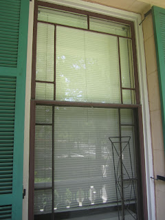
The cornice itself is beautifully inset with alternating semicircular windows and semicircular panels with rosettes. An interesting feature is that the molding above the windows projects further than is usual and is decorated with panels flanking a central rosette, making this a paneled cornice. The porch and window surrounds, all of limestone, are also plain, notable because of their strong keystones, and, on the second floor, small, almost abstract foliage bosses. The brackets are on the two s-curve type. The front door, which is flanked by sidelights and has a lunette window above looks like a conservative throwback to Federal or Greek Revival design. The front steps with their terraced balustrade seem particularly calculated to appear grand and imposing. I like how Reddick and his architect didn't skimp on the decoration of the sides; it is consistent all around the house. The enlargements of the above photographs below highlight a couple details.
The house's website has a great deal of information including interior views and floor schematics.
.jpg)
.jpg)


