 |
| The Seth Adams House, Providence, RI. Photo: Wikimedia |
Sunday, June 30, 2013
The Seth Adams Double House, Providence, RI
Saturday, June 29, 2013
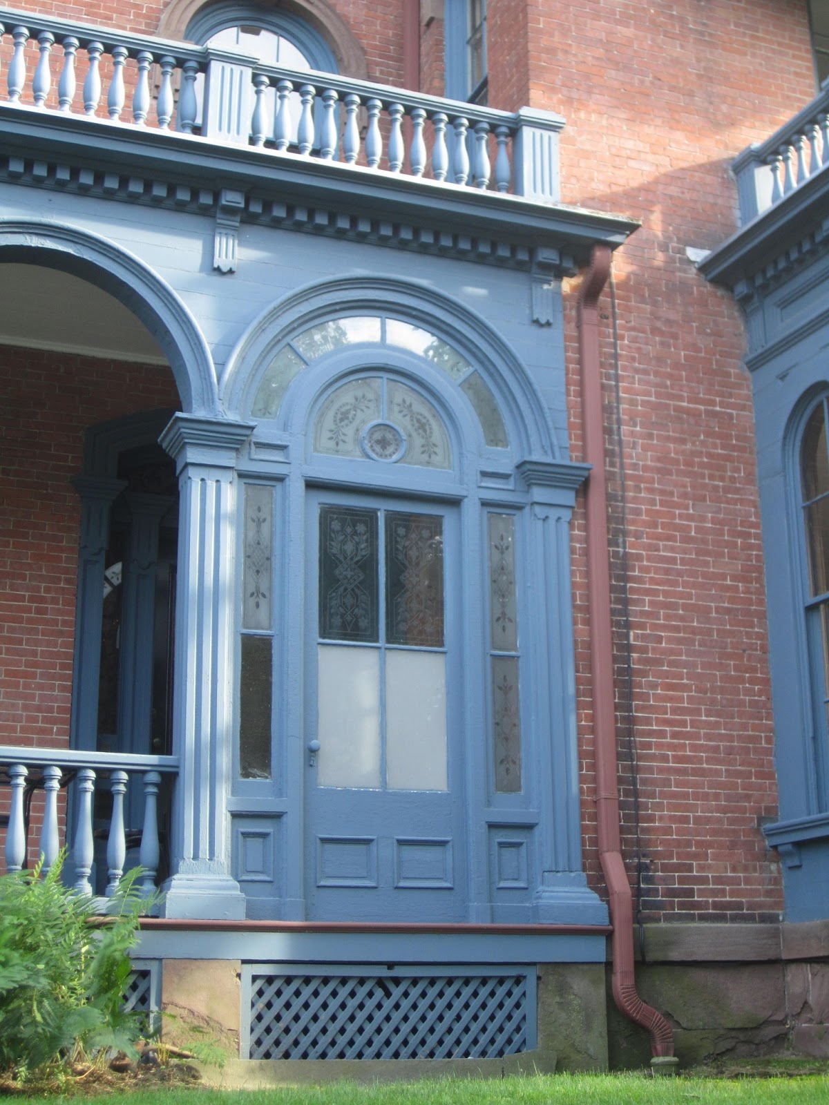
The Henry Lippitt I House, Providence, RI
 |
| The Henry Lippitt I House, Providence, RI. 1856 |

This was the first house constructed by Henry Lippitt in 1856, and it lies directly across the street from the house he constructed in 1865. He apparently left this house after several children died here of scarlet fever. Perhaps the memories were too much to remain there (that is so Victorian!). This is a double house that simulates a single family home. The architect was the famous Russell Warren, one of Rhode Island's most famous architects of Federal and Greek Revival designs. This work, which was started when the architect was in his seventies, exemplifies his versatility. Although a double house (the second entrance is tucked around the back), it employs the irregular plan without the customary tower or tower projection, giving it a distinctly L shape. It displays a variety of similarities to other Providence mansions of the period, brick facing, brownstone trim, sobriety of design, but it does not fall into the Anglo-Italianate of the later Lippitt house.
As we might expect, the window moldings are spare and simple, although there is a variation of window shape on the second story, with a round headed window marking the spot of the expected tower and the odd placement of windows on the projecting section's side. The third story windows are segmental arched, but interestingly, they intersect the entablature (which is a simple dentil, bracket, cornice affair), a technique we saw on the Decatur Miller house in Baltimore, which is repeated on several Providence Italianates. This creates an undulating cornice effect. The porch is arched with square paneled columns and a bracketed simple cornice, a design which is repeated with a bit more elaboration on the box window. The box window is surmounted by a double window with a wooden awning, one of the fripperies allowed in Providence's sober aesthetic it seems. Although the house is simple enough, one thing caught my eye. Opposite the front door, one bay of the porch has been filled in with exceptional etched glass with panels of many colors cut to clear in floral designs. I'm not really sure about the origins of this. Cut glass panels are valuable enough that some enterprising antique hound might have collected them and created a frame for them to enclose the space at the front of the door. The frame, however, looks and feels old in its composition. It might actually be a period embellishment, and if it is, it is unprecedented. It would shower those awaiting entry with a barrage of colorful light effects, a sophisticated and beautiful concept which seems very Victorian to me. Whatever its origin, it is a truly exceptional object!

Friday, June 28, 2013
The Henry Lippitt House II, Providence, RI
 |
| The Henry Lippitt House II, Providence, RI. 1863-5 |

Any walk through Providence will tell you that it is a city of fantastic Second Empire homes; however, Providence developed its own sober style of Anglo-Italianate detached house that characterized the homes of the wealthy. At the height of its wealth in the 19th century as a textile manufacturing center, Providence was littered with beautiful homes, most of which survive today in this well preserved city. All the homes I will be featuring are on College Hill, one of the best preserved 18th/19th century neighborhoods in a major city in the US. Providence's Italianate architecture on College Hill is very consistent and simple. It's characteristics include almost an obsession with the symmetrical plan, brownstone and brick facing, simple decorative schemes, a belt course between the first and second floors, Anglo-Italianate influence in the cornice and window surrounds, and three full stories.
The Governor Henry Lippitt house was completed in 1865 and remained in the family until the 1980s when it became a house museum. The house is the second Lippitt house; the family's earlier home built in 1856 diagonally across the street, seems to have been abandoned by the family after several of their children died in the house of scarlet fever.
The house has the gravitas expected of a gubernatorial residence, but does so with simplicity and elegance of form rather than exuberant ornament. It follows the symmetrical plan and the facing is of brick with brownstone and wooden trim. The painting of the wooden trim brown to harmonize and simulate brownstone is period appropriate. The central bay projects from the house, which is almost a cube and is topped by a triangular pediment. The first floor is set off from the second by a strong belt course of brownstone. Quoins (pieces of staggered stone) at the corners give the impression that the first floor serves as an English basement and differentiates it from the second and third; the blind balconies further increase the importance of the second floor as a "piano nobile" even though it doesn't serve this function. The window surrounds are simple eared brownstone moldings with brackets and a cornice, all appropriate to the Anglo-Italianate's dependence on Renaissance precedent. The third floor windows are segmental arched. The bricklaying at the corners and under the entablature suggests pilasters which divide the composition. The main cornice is simple with brackets and dentils. Throughout the house, classical proportions are maintained and this is evident in the appropriateness of every detail to classical precedent. The portico and surmounting window are especially lovely specimens. The portico projects from the facade and ends in a semi-circle; the Corinthian columns and delicate carving in the frieze are particularly nice touches which are repeated on the Palladian window above with an elaborate surround. The front door is segmental arched and has elaborately paneled leaves. I actually love this house's proportion and especially like the carving and composition of the porch.
The sides of the house as well do not disappoint, repeating the same level of decoration as the main facade rather than skimping as many houses do. The north facade features a port cochere (a porch under which carriages could drive) which breaks with the house's classicism with a more Italianate design with filleted corners and heavier molding. The port cochere is attached to a shallow bow projection in the facade. The south facade features a central bow projection as well that is more sharply curved. The first floor windows on either side have wooden awnings and opened onto balconies. The following pictures show some details.


 |
| The north facade |


Thursday, June 27, 2013
Hopewood: The William Bailey House, Providence, RI
 |
| William Bailey House, Providence, RI. 1848 Photos: Providence College Wiki |

Here we have a particularly strange example of Italianate. Built by an unknown architect between 1848 and 1850 for William Bailey as the centerpiece of his estate Hopewood, it was bought by a convent, girl school, and is currently called Dominic Hall and is a part of Providence College, whose art class wiki provided me with many images and plenty of information. The house follows a somewhat squashed version of the side tower plan. This squashed version is uncommon, but it forms a distinct type that I will explore in a later post. What's impressive about the Bailey house is the undulation of the front facade and the focus on octagonal forms rather than the usual 90 degree angles popular in Italianate. This is reminiscent of the Vanderheyden house in Ionia. The projecting pavilion has chamfered corners with the central section having Greek Revival triple windows and narrow side windows, as if it were a large bay window. The central section has an arched window on the second floor and an arched door with a glass surround. The hip roof has a dormer. The bayed porch continues the undulating shape. The tower is recessed and is octagonal, a very uncommon shape that occasionally occurs. The four stages of the tower have variation between round, arched, and rectangular windows. Small exterior awnings top the flat headed windows, while the round windows have a small course of stone. The whole house is made of a grey stone, that gives an weightiness to the design.
Interestingly, this elaborate undulation is not repeated on the sides or the back. The sides have two rectangular gable fronts with box windows. Thus, the back has right angles and the elaboration on the front seems rather just glued on to the boxy back facade. The decoration of the house is severe; besides the wooden awnings, the elements are stripped to their basics; the cornice lacks brackets, and the porch eschews complex columns or decoration. Overall this is a fascinating example that chooses geometry rather than ornament as its mode of expression. Pictures of the well preserved interior (which has seen a great deal of modification and then restoration) can be found on the wiki site.

Wednesday, June 26, 2013
The Connell House, Ephrata, PA
 |
| The Connell House, Ephrata, PA. 1860 Photo: Wikimedia |
 |
| Photo: Wikimedia |
Tuesday, June 25, 2013
Mayhurst: the John Willis House, Orange, VA
 |
| Photo: Wikimedia |

 |
| Drawings from HABS |
This plantation house, one of the most exuberant I have seen, is in Orange, Virginia. It was built in 1859-1860 for John Willis, a relative of President James Madison who named the house "Howard Place". It passed through various owners before it was renamed "Mayhurst" in 1902. The house follows the symmetrical plan with a hip roof and cupola and is faced with wood that has been cut to simulate stone, an elegant and costly effect. The house may have been designed by Norris G. Starkweather, who designed a similar house that I have featured, Camden, nearby. The embellishments to the design and the inventiveness and variety are characteristic of his style. Another candidate is Charles Haskins, another architect in the area. Regardless of who designed it, it is definitely the product of the architect rather than the carpenter/builder.
The symmetrical house features central gables on each side. The basement is brick with paired windows. The first floor features paired, shallowly arched windows with balconies and simple hood moldings. The front door is arched with a glass surround and is fronted by an unusually simple three bay porch that could be a later replacement for another porch. The second floor is where the eccentricities arise. The flanking windows are Palladian, an unexpected choice. They have a bracketed hood molding, and the center panel features Venetian tracery. The second floor side windows mirror the central panel's tracery and shape. The central window on the front has two arched windows supporting a large 'rose window' with spoke tracery. In essence this is a sort of exaggerated Venetian tracery, and is a very uncommon shape especially for a private home. I have only seen examples of this type of window on churches and public buildings, so its presence in a private home is noteworthy. On the sides, the rose window is repeated under the gable with a drippy hood molding.
Approaching the third floor, the cornice is undulating and is pierced by small windows. The brackets are of the c and s scroll type and are placed in a somewhat odd pattern with one at each corner, then pairs, then two small brackets framing each window. Each gable is topped by an anthemion, a stylized palmette. These cut out appliques are also found on the impressive cupola. The cupola has an odd manifestation of Palladian windows with a pointed central window and flat flanking ones. The cornice follows the window line and is gabled, reflecting the general form of the house. The cupola roof is fantastic; it is bulbous and forms one giant spire that has cut out decorations ascending to it. The color choice for the house, all white, is unfortunate because it flattens out the details in a way that makes the house look more dull than it is. In the early 20th century, the way people handled Victorian exuberance was to tone it down with monochromatic paint schemes, which are not at all period appropriate and reflects a disdain for Victorian ornament and design. The house is currently a bed and breakfast; a look on their website will show you some interiors.
HABS has a plan on record for the house:

Monday, June 24, 2013
Camden: the William Pratt House, Port Royal, VA
 |
| Camden, Port Royal, VA. 1857-59 Photos: HABS |


The tower was truly a lovely piece. The stump of it remains on the back of the house. From the designs, the base of the tower had an arched door like the front door that had a glass surround. The second stage copied the front as well with a triple arched window. The third stage was separated by a belt course and had semicircular windows that had jigsawed scroll work above them. The top of the tower had highly elongated brackets that filled the entire upper story. In the center were Palladian windows with balconies. The cornice had an arch in the center of each side that had anthemia (vegetable decorations at the peak of a gable) and palmettes. The whole was covered with a hip roof and an impressively tall spire. The tower would have been beathtaking and was certainly envisioned as the pearl of the entire composition. If anyone's looking to blow some money on a historic restoration...
Another interesting feature is the left facade of the house that has the servants' wing. This is simpler in detailing but nonetheless grand. A porch faces the front of the house. But the side has a reversal of the house's formula, with segmental arched windows on the first floor and round headed ones on the second. A pedimented door with a bracket surround (an interesting feature we have noticed in this area) is in the center bay. Another quirky detail are the paired tombstone blind arches on the chimney. The house betrays the careful thought and design of a real architect from tower to chimneys. Along with the Backus house, they remain two interesting Italianate works for this architect and deserve to be considered alongside each other. The interior also remains intact and retains some of the family's original furniture. All the following pictures are from HABS, and it is worth a look at their 38 photographs online.


Even the gasolier light fixtures are in place. This shows also the finely crafted plaster ceiling medallions.
Saturday, June 22, 2013
Painting the Italianate House
The subject of painting an Italianate house is one that is still of concern today. Often, owners who buy an old house are confronted with a horrendous, bizarre, historically inaccurate, or just plain ugly paint scheme that destroys the house's effect. Paint is as important a part of architectural design as anything else, and the creators of Italianate homes put as much thought into their paint schemes as the design. For advice on painting a 19th century home, I recommend wholeheartedly Victorian Exterior Decoration: How to Paint your Nineteenth-Century American House Historically by Roger W. Moss and Gail Caskey Winkler, an invaluable source of information for painting all types of Victorian homes. It is to their work I owe most of this discussion.
Before the 1840s, most American homes were painted white with accompanying green shutters. Despite the various wild colors found on Colonial houses such as black, red, bright yellow, dark blue (an electric blue house in historic Deerfield comes to mind), Federal architecture and especially Greek Revival favored a stark white, no doubt to simulate the classical white stone of ancient Greece (of course Greek architecture historically was painted a variety of zany colors, but they didn't know that very well at the time!). In Cottage Residences, Downing railed at this prevailing custom, saying "the glaring nature of this color when seen in contrast with the soft green of foliage, renders it extremely unpleasant to an eye attuned to the harmony of coloring, but its very great prevalence in the United States could render even some men of taste heedless of its bad effect. No painter of landscapes that has possessed a name, was ever guilty of displaying in his pictures a glaring white house...on the contrary...the buildings have a mellow softened shade of color in exquisite keeping with the surrounding objects." (14-15)
For Downing because houses were set in a natural landscape and white is not a 'natural' color, its presence was incongruous with its surroundings. The pleasing effect of sunset and the variation between shades due to shifting light inspired Downing's disapproval of white, a color that was "always lighted up" and never mellowed by changing light. He advises that houses should be painted the color of "soil, rocks, wood, and bark" to harmonize with objects in the landscape rather than contrasting with them. He also maintained a larger house should be painted a darker color while a smaller house should be painted lighter because of its exposure. Trim should be painted several shades darker than the main body of the house. To illustrate his ideas, Downing in Cottage Residences produced a hand painted example of appropriate house colors, pictured below. A, B, and C, he remarks, are shades of grey while E, F, and G are "drab or fawn color"; Downing preferred the fawn shades especially because they simulated Portland Stone.

Although Downing's color palette was not completely followed (green for the main body was advocated by some of his followers and lighter trim was often allowed), the main colors for a home were overall grey or brown. Sometimes light blue, light purple, and pinks were used as well and represent more flamboyant but historical colors. In 1861, John Riddell's book, Architectural Designs for Modern Country Residences (which can be viewed here) included the first color plates showing appropriate colors for houses. I have posted a few below, but the book includes several more. This book is essential to knowing about how houses were painted in the early 1860s. Downing's palette is evidenced here, although there are variations.
We can see the variations of fawn and grey along with yellow. Trim in these houses is often a lighter shade, and certain details, especially the stripes on the cupola trim are picked out. One aspect to note is the painting of the tent roofs with stripes; this was a particularly common custom on Italianates that is rarely in evidence today. Although it might seem ridiculous or garish, that's how they did it. Notice as well how the architect takes drape color into consideration. I believe the varying drapes represent alternatives for a house. In the first example below, the drapes could be red or blue. Sometimes in the plates they even fill the cupola with cloth. For Riddell, the drapes seen from the street were an important part of the effect and should have a uniformity. Finally note the main roofs. Unlike the typical grey roof we expect, many of these houses have tin, copper, or tile roofs. Although of course grey slate was often used, there was always a preference for more colorful roof effects especially tile which simulated Italian architectural practice.


Ultimately, this color scheme may strike us a dull. Come on, it only includes grey, yellow, and brown! What about the colorful "painted ladies"? The painted lady style, which originated in San Francisco in the 1890s was California specific and much criticized at the time. Although it may be appealing to make your house in New York or Ohio stand out with bright colors, that doesn't reflect historical practice at all. Another thing to consider is that the Victorians loved to simulate more expensive materials; it was a world of artifice. Doors of pine were painted to look like more expensive wood (faux graining), for example. Often a house may have some stone elements such as window surrounds or lintels, and when these are of stone, the wooden trim and architectural elements should be painted to resemble the color of the stone parts. Also keep in mind that the usual finish for an Italianate was either stucco or brick. Both were often painted and the chimney as well was painted to match the house's color.
As the 1870s arrived, darker colors began to be applied to houses, especially olive, green, and orange. This period loved 'tertiary colors' or colors made from mixing two secondary colors like russet (violet and orange), citrine (green and violet) and olive (green and orange). These tertiary colors were destined in the 1880s to mostly replace Downing's scheme as the current fashion although the Downing palette remained throughout the century. Italianate was waning by the 1880s, though, so these colors apply to late Italianates of the 1870s, when the Downing palette was still popular, and Queen Ann houses, where they dominated. The white trim was more an influence of colonial revival design in the 1880s and 1890s. Previous to the interest in colorfully painted Victorian homes in the later 20th century, the fashion was to paint the houses completely white to lessen the drama of the very out of fashion architectural complexity. I agree with Downing that this is the worst way to paint a Victorian. Not only is it inaccurate, but it makes a house filled with architectural interest boring and flat when it should be fun!
The Victorian house, and the Italianate in particular, should be colorful but not overly so. If you want to achieve the original effect that the architect or designer had in mind with your house, work within the right palette to keep a level of design integrity.
Friday, June 21, 2013
The Dodson-McKenny House, Petersburg, VA
 |
| The Dodson-McKenny House, Petersburg, VA. 1859 Photo: Among the Ruin |
 |
| Photo: Wikimedia |
One thing I like about this house and have seen only in a few others (an example in Savannah comes to mind) is the tripartite window over the entrance that has flat sidelights and a segmental arched center. In essence, this is a sort of watered down Palladian. It is an uncommon window format, but an attractive one to me. Another thing to notice is the paired arched windows on the side. I've noticed that the Ragland house as well as some others have only two round headed windows in the center on the side. Perhaps this is another element of the Petersburg style. The house includes some servant outbuildings. Petersburg should be proud that many of its homes retain their original outbuildings. The current use as a library seems to have left the interior intact. One writer talks about the romance of wandering through the maze of shelves crammed in this house and about the experience of being surrounded by Victorian bric-a-brac as an enhancement to their library experience. One hopes that even if a new library is constructed, this house will remain a public building. There are a couple interior views here and here.
Thursday, June 20, 2013
The Reuben Ragland House, Petersburg, VA
 |
| The Ragland House, Petersburg, VA. 1856 Photo: R. W. Dawson |
The upper floors are pure Italianate. The central windows which are both taller and wider than the sides, feature Venetian tracery. The flanking windows vary between segmented arches on the second floor and round arches on the third, a variation we have seen in Petersburg. Despite the third story, we can see this house follows the pattern of the Scott and Williams houses in having larger windows flanking the door on the first floor and above the door on the second floor. All the upper windows are topped with cast iron hood moldings that feature in different places, egg and dart moldings and keystones. The cornice is simple in design with paired brackets of c and s scrolls. The cupola is also simple, although it has a triple row of windows with a larger central section. A view of the side of the house shows that there is a small enclosed hyphen with an undulating cornice connecting the house to a back building. One outstanding feature of the house is the windows themselves. A look at the house shows that there is an odd complexity to the tracery in the windows, which resemble typical Queen Ann tracery. A picture from an old website for the bed and breakfast that currently inhabits it, shows that the windows have beautifully etched stained glass, an impressive and very rare treatment. This was probably an addition of the 1880s, but it is a particularly beautiful feature.

The site for the Ragland Mansion Bed and Breakfast shows a great deal of the interiors which are very well preserved with some of their mid 19th century design intact.
Tuesday, June 18, 2013
The James M. Williams House, Petersburg, VA
 |
| The Williams House, Petersurg, VA. 1879 Photo: R. W. Dawson |
Subscribe to:
Posts (Atom)