Showing posts with label rotated side tower plan. Show all posts

Thursday, February 8, 2018

The Clark J. Whitney House, Detroit MI

The Clark J. Whitney House, Detroit MI. 1857 Photo: Scott Weir

The same house in 1882. Photo: Scott Weir
It's rare to see an Italianate remodeled into another Italianate. Typically you slap a mansard roof on top or a Queen Anne gable and call it a day. But that's not what Whitney did with his chaste 1857 house in Detroit. Instead, he took his genteel Italianate and decided to display his new status with a zany new design, doubling the size and basically constructing a new house right into the fabric of the old. The house has a rotated side tower plan. In the 1857 design, the house had a projecting bay with two windows and a typical three stage tower, all ensconced in a lovely arched porch topped by a railing with a guilloche design. The window treatments were simple, with rectangular windows that had rococo iron designs as the hood moldings on the second floor and arched windows on the first floor and tower. The cornice design featured a thick architrave molding with double s scroll brackets (Detroit couldn't get enough of those) all very closely spaced. All in all it was a nice house reflecting the taste of the 50s.


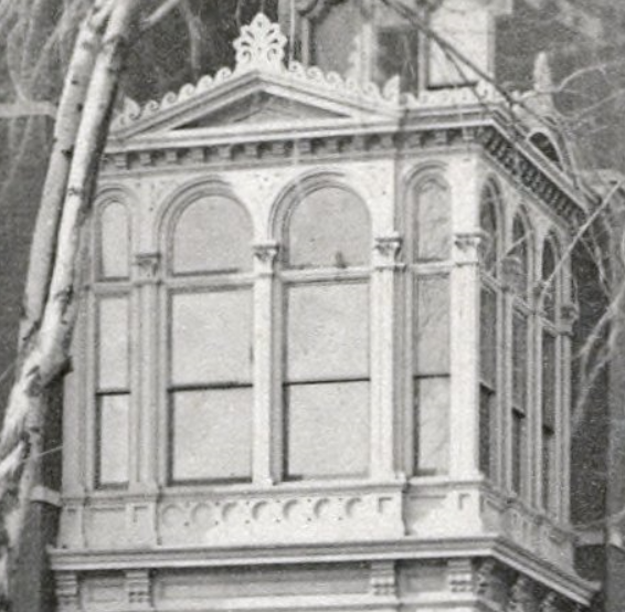
When 1882 rolled around, Whitney had made some money. He was a major purveyor of Detroit's music scene, selling instruments and sheet music. In 1882, he helped rebuild the old opera that had burned and really came into his own. No doubt, the rebuilding of the opera (in a rather refined modern French design) caused him to think about updating his own home. To the fabric of the old house, Whitney started by removing the wrapping porch, replacing the porch on the front two windows with a bracket surround supporting a balcony with a series of segmental arches and hanging drops, a very picturesque touch. Around the door, a rich and complex two story porch was built. The rectangular windows were disguised by segmental arched stone surrounds (oddly, an incised angular line runs through the arch). The center of the entablature on the projecting pavilion was cut (after new c scroll brackets were installed), the roof was raised, and a dormer was added with a segmental arched open pediment. Although the old decoration of the tower was retained, the eave was removed and a new story was attached with a triple arched palladian window, no doubt to compensate for the poor optics of a stubby tower with a steeper roof slope. A rather bizarre and heavy finial crowned the whole. The most drastic change, however, was the addition of basically a second house to the side, designed in the pavilion plan. Unlike the old house, where the windows were only disguised as segmental arched, here they were actually so, and were connected by a string course of stone that distinguished the older from the newer section. The new wing was all about diagonals, with two two story bay windows flanking an equally diagonal lacy porch. One odd feature is the bracket placement on the diagonals of the bay windows, with few brackets there contrasting with the forest in the other sections. 


So, which do you prefer? 1857 or 1882? I'd love to know!

With this, I end my short series on Lost Italianates of Detroit, but will revisit the topic soon.

Friday, February 2, 2018

The H. R. Newberry House, Detroit, MI

The H. R. Newberry House, Detroit, MI. 1875 Photo: Scott Weir

And now for something totally different than the Detroit symmetrical plan, the H. R. Newberry house, built by a railroad executive in 1875, presents us with a very different design concept. Following the rotated side hall plan, the Newberry house has such bulk and verticality, rising all across to a full three stories, it almost looks like an apartment building. It seems that there are two different building phases here, given the disparity of elements, with the left three bays being different than the others and apparently an addition of the 1880s. The house features a typical 1870s style for the region, with brick and stone accents dividing the surface into bands and Eastlake incised designs. The first floor windows are simple rectangles, while the second floor features windows with convex fillets in the corners, and the third floor has segmental arched windows with convex fillets, with each stage become more complex geometrically. This is topped by an entablature with very shallow angular brackets and a row of dentils. A small engaged pediment characterizes the right hand bay while a more elaborate broken pediment with spiral ends characterizes the left; this is a particular favorite design in Queen Anne architecture. The tower features brick panels and pilasters and a hefty palladian window, a rather ponderous design that looks more like a castle or Renaissance tower. The cornice is broken three times, with an engaged triangular pediment flanked by two engaged rounded pediments, a rather elaborate, almost baroque touch. The porch as well is particularly lovely (note the cute balcony at the corner to the right. The first stage has horseshoe arches on thin banded columns, but above is an exquisite glassed conservatory with a series of alternating thick and thin arched windows, a triangular pediment on the front, arched on the sides, and to top it all a cut out Vitruvian scroll and anthemion, providing a nicely frilly contrast to the house's bulk. Note as well the delicate iron fence of rinceaux.


Sunday, May 1, 2016

The Jesse H. McVeigh House, Hannibal, MO

The Jesse McVeigh House, Hannibal, MO. 1885 Photo: Brandon Bartoszek
Photo: Amanda Baird/BlackDoll Photography
The Jesse McVeigh house, built in 1885 for a member of one of the major families of Hannibal, is one of the most photographed homes in town, certainly due to its beautiful state of preservation, eye catching features, and attractive paint scheme, even if the painting is a little inaccurate for the period. The house follows the rotated side tower plan (of course this example is towerless, though the side tower mass is expressed by the right hand bay), which in essence is an irregular plan with the short side facade facing the street as the principal expression of the house. The home has a typical steep hip roof that nearly every Hannibal house has and is enlivened by beautiful detailing. The segmental arched windows have elaborate label hood moldings with fanciful, impossibly un-classical brackets, thick keystones, and Eastlake incised designs. A bay window on the front continues the general design. The cornice has a simple architrave molding with small entablature windows, a run of dentils, and elaborate s scroll brackets. Perhaps most impressive, though, is the abundance of porches, with elaborate paneled post supports that form shouldered arches. On the right, the porch has two stories (though the upper porch might be slightly later), while on the left, the porch gracefully curves out and projects an entire bay from the facade, a very uncommon feature, as side porches usually are far more closely attached to the facade. This is perhaps an influence of the porch mania and inventiveness of contemporary Queen Anne design that gives unlimited scope for non-traditional porch possibilities. It does create an awkward join between porch and facade, but nonetheless creates a beautiful open space around the entrance.

The plan must have been popular. It seems that John Mounce beat the McVeighs in introducing this plan in his house at 207 N Maple in 1880. The Mounce house is basically identical (without the second story porch addition) although the second story windows are joined rather than separated as in the McVeigh house.

Mounce House, 1880 Photo: Mike Steele
Photo: Amanda Baird/BlackDoll Photography

Monday, January 13, 2014

The Susan Sturges House, Mansfield, OH

The Susan Sturges House, Mansfield, OH. 1880 Photo: Wikimedia
The Susan Sturges House (NRHP) in Mansfield is located at 317 Park Ave. in Mansfield and was occupied by Sturges, an important local philanthropist. It is a late wooden Italianate from c. 1880, but the home appears to embody the style of the 1860s and 70s rather than the stripped down version of Italianate seen in the 80s. The house follows the rotated side tower plan with a long bay on the left side of the front and a short bay on the right side, giving the front an asymmetrical appearance. The two story front porch, an unusual feature, may be a later addition to the house; it certainly suggests more southern precedents. If it is later, it was designed to harmonize in a simplified form with the more elaborate side porch seen in the back. The house has simple eared, pedimented window surrounds that suggest Greek Revival style, but these are enlivened by keystones with incised Eastlake carving. The brackets are simple s-curve types, and the cornice includes elliptical panels and windows, a feature commonly seen in earlier decades. The feature I like most about the house is the fantastic wooden awning highlighted in the photograph below. Unlike the commonly seen forms with a half hip roof that slopes, this one has a triangular gable the curves and is enlivened by wooden gingerbread. This is a truly delightful feature!

Wednesday, August 21, 2013

The David Q. Liggett House, Wooster, OH

The David Q. Liggett House, Wooster, OH. 1861 Photos: Wikimedia


The David Q. Liggett house, which goes by a variety of names based on those of different owners, was built in 1861 for a significant merchant in the town. It follows the irregular plan, but since the recessed wing is so short (only one bay) it gives the impression of following the rotated side tower plan. The house seems to have been altered by successive owners who added in the late 19th or early 20th century a Colonial Revival porch and glassed in vestibule. You can see from how this wraparound porch marrs the facade how troublesome it is to mix architectural vocabularies. Still it has a bit of charm, like a sock thats been mended with many colorful patches. A large and exuberant Second Empire addition seems to be attached at the back. The strapwork adorning the facade is also probably an older addition, suggesting the influence of the Stick Style or Queen Anne. Still the house retains most of its Italianate features. The design of the facade is simple enough, with plain molded surrounds adorning the windows which are jazzed up a bit on the round arched window on the tower. I'd guess that if the strapwork is not original, the house was brick or stuccoed. The cornice again is plain with double s-curve brackets and an architrave molding; the cornice continues around the tower with a particularly large roof, making it seem like the tower is stuck on the roof rather than an independent entity. The tower is a particularly cool example. It has double tombstone windows with thick moldings. Instead of the usual hip roof, though, it has a sharply angled hip roof with a small monitor with semi-circular windows topped by an iron cresting. This is a lovely little feature that makes some steps toward Second Empire without embracing the mansard roof. Although the house is well painted, I do think the pink a bit much. After all, who really wants to live in a doll house?

Tuesday, August 20, 2013

The William Judd Mix House, Oregon, IL

The William Judd Mix House, Oregon, IL. 1874 Photo: Teemu008
The William Judd Mix house in Oregon, IL was built in 1874 for Mix, a store owner and merchant, and is a lovely example of Illinois Italianate design. It is currently a bed and breakfast. It follows the rotated side tower plan, an interesting variant on the general Italianate plan types with the tower and a projecting pavilion taking up the front facade. The facade is brick with what looks like limestone detailing that forms the simple window hoods. The windows show a variety of shapes, though double tombstone windows seem to predominate. The variation in the bay window on the front, with two round headed windows flanking a window with filleted corners (a very big feature of the 1870s) is particularly nice. The cornice, which is of the paneled type has double s-curve brackets and dentil moldings. I like the front door surround, which is wood and features an interesting little semicircle in the center of the molding. The tower facade itself has a recessed blind arch in the brickwork, which adds some distinction to that element of the facade. The tower's upper stage has unusually two pairs of double tombstone windows set in rectangular frames, a nice feature, with moldings forming pilasters between them; a tall finial completes the vertical thrust found in this type of plan. There is an interesting side porch to the right that seems to be Gothic, with four point arches. A final note, the house has a more steeply pitched hip roof; this seems to be a feature of Illinois houses of the 1870s.


Monday, August 12, 2013

The Russian House, Middletown, CT

The Russian House, Middletown, CT 1860s, 1870s? Wikimedia
The Russian house, is a house I do not have information about. It sits at 163 High Street and follows the rotated side tower plan, even though it never had a tower. The distribution of the windows into doubled windows on the left and smaller windows and entrance on the right is consistent with this type of massing. The house looks to me like a product of the 1860s or 1870s, although it is restrained in its ornament, which fits in with the sober appearance of some of High Street's homes. It is called the Russian House because it is a residence facility that is involved with the Russian community. The house is well preserved with restrained window surrounds, simple brackets, and an architrave molding. A cupola tops the roof. The porch has interesting columns with thick molded capitals. All in all, it's a charming little house.

Sunday, August 11, 2013

The Hart-Root House, Middletown, CT

The Hart-Root House, Middletown, CT. 1880 Wikimedia
This house follows as well the rotated side tower plan seen at 281 High Street. It was built in 1880 and was inhabited by the Hart and Root families; it's currently a faculty residence. The house has undergone some changes in its career, with its tower being lopped off at some point (I'm sure it followed the usual plan of three arched windows). Still the richness of detail can be seen in it, and it seems to have many features in common stylistically with the Coite house, notably its panel cornice with bull's eyes intersecting the panels. Features I like about this house are the closely paired brackets in the gable front, a feature that gives the cornice a lot of volume. Although the window surrounds are simple, they jibe with the subdued ornateness, and the arched window next to the door is a strange feature, which I am not sure is original. As for the odd box window that juts out into the porch, I have no idea how old it is. It does seem to be integrated into the porch's composition with the pediment, but the design is very 1890s Queen Anne. It could be a clever modern piece. Still, if it can fool the viewer, it's doing its job.

Saturday, August 10, 2013

281 High Street, Middletown, CT

281 High St. Middletown, CT. 1850s?


I don't know a lot about this house. It currently serves as the anthropology department of Wesleyan, but it's a particularly nice looking one.This house follows a plan we haven't seen very much of. It is very similar in design to the side tower plan, and it is oriented in the same way as the Sloan house in Oswego with the tower and side projecting pavilion oriented toward the street. This orientation changes the entire way the house is grasped, giving it, from the street facade, the appearance of being thin and vertical. Because only one narrow bay and the tower are the only parts readily visible from the street, it also makes the house look much more grand. This type of orientation is such a specific feature, that from now on, I am going to say that houses following this plan follow the rotated side tower plan. It might not be the most elegant phrasing, but it gets the point across. Interestingly, this house manifests a variety of images. On the right facade, it has a modified side tower plan without a central receding section. On the left facade, which is also visible because it sits on a corner lot, it has a modification of the irregular plan. It is all just a side tower plan that's been futzed with a bit. This rotation of the plan allowed architects to fit a large house with interesting facades on a very narrow lot. When an expansive style like Italianate is confronted with narrow property, goofiness is bound to occur.

This is one of my favorite houses on High Street. It bears a strong resemblance to the work of Henry Austin in New Haven, particularly the Norton house, although I do not think he designed it. The facade is stuccoed and from the street you can see the projecting principal bay, which has a shallow gable, has a box window surmounted by a triple window topped by a large wooden awning. The front door sits at the base of what should be the tower (I don't believe this house was constructed with a tower) and is recessed into an arched porch, a very elegant feature. The detailing is not overly elaborate; the window on the tower has a bracketed pediment over a simple surrounding molding. The house has thickly spaced brackets with an architrave molding, a strong characteristics of early 1850s design. The left facade is rather normal, with an interesting series of window types, until you get to the back where there is an odd gable that suggests a projecting pavilion but in reality does not correspond to a change in volume. This suggestion of a pavilion is reinforced by the two story box window with a tent roof (an odd feature). The right facade is a solid mass with a projecting bay window pavilion.

What I really like about this house is partly the finish, which I think is able to do a lot without being too ostentatious. The color scheme is appropriate, and reflects those in Riddle's 1861 book. Even though it lacks a tower to make it even more vertical, I think it is able to communicate what its builders hoped.