 |
| Woodland Terrace, Philadelphia PA. 1861. |
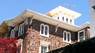
Sloan arranged the progression of houses with an eye to symmetry without creating monotony, an eye for large scale composition he demonstrated on Pine Street. On the east side of five bays this can be seen best. The two end units follow the irregular plan, but while the northern house has a stubby gabled tower with two rectangular windows, the south house has a full hip roof tower with triple arched windows. The three central units follow the symmetrical plans, but units two and four do not have cupolas, while the third unit in the center has a large cupola divided between the two houses with four arched windows, marking the center of the block and creating emphasis. Sloan has masterfully balanced the composition with regularly spaced focal points in units one, three, and five and provided a deemphasized background in units two and four. This design was somewhat complicated in its repetition on the west side, since the even number of houses prevented the central focal point. Sloan handled this by putting cupolas on both houses in the center, three and four, maintaining a central focus. The most unfortunate loss is the demolition of half of the final unit on the west side, depriving that section of its grand punctuating tower.
All the houses were designed consistently, with facades of irregularly cut brownstone (a Pennsylvania specialty) divided into three floors, with rectangular windows on the first two floors with bracketed hood moldings, a stringcourse between the second and third floors, with arched windows on the third floor and paired brackets. The brackets are of the double s scroll type. The principal facades feature fine cut brownstone, while the sides are made of irregular fieldstone. The porches are simple, with small brackets, sinuous ogee curves, and thin paired posts supporting the porch (lost in a few examples). That is the base design that forms the stylistic unity between each unit. Originally, the houses would probably have featured a very consistent paint scheme, avoiding the jarring effect when owners paint different sides of a unified house different colors, divided in the middle. The entire ensemble was photographed by HABS.
The East Side of the row:
The West Side:
Another double house of interest, sadly demolished, one block over from Woodland Terrace at 435 S. 40th Street where the transit station is now. The house featured two towers surrounding a central block of paired windows with wooden awnings, balconies, and an elaborate arched porch with fine jigsaw work. While not attributable as Sloan, and perhaps a bit too fanciful for him, nonetheless, it displays Sloan's influence in its fascination with varied massings, differing volumes, and variety in design, producing a balanced symmetry.
This same design, certainly by the same builder could be seen rendered in Second Empire on Baltimore Avenue:
A final Italianate of interest in a very Sloan like style could be found across the street from the 40th street houses, at 440 S. 40th Street. It looks like it might have been a triple house by the number of entrances. The house follows the pavilion plan, though somewhat asymmetrically. A large pavilion on the left featured a two story bay window (with a tower to the rear), while the left hand pavilion was two bays, evenly spaced. The central four bays had a large porch running across the front. The quoins, the string course, the side placement of the tower, and the simple porch are all highly reminiscent of Sloan's designs nearby on Pine Street and demonstrate his influence in the area.


No comments:
Post a Comment